
Can you get the look of raw, poured concrete on a standard drywall wall — without the weight, cracking, or cold feel of real concrete? Yes. The finish that does it best is called venetian cement, and it’s the same family of hand-applied lime and mineral plasters I work with every day. It delivers that stripped-back, industrial aesthetic most people associate with polished concrete floors or exposed aggregate — but it goes on over drywall, stays warm to the touch, and won’t crack on you six months later.
What is concrete look Venetian plaster — and how is it different from actual concrete?
Concrete look Venetian plaster is a hand-troweled mineral finish — typically a marmorino or spatolato-based product — formulated to read visually as raw concrete without being concrete at all. The key distinction: real concrete is structural, poured, and extraordinarily heavy. What I’m applying is a thin-coat decorative plaster, a few millimetres at most, that sits on top of your wall system.
Real concrete on a drywall substrate isn’t realistic. Drywall flexes with seasonal movement, temperature swings, humidity changes — Ottawa sees all of that. Concrete doesn’t flex, so it cracks. Venetian cement is formulated with binders that move with the substrate. You get the grey tones, the subtle aggregate texture, the matte depth — none of the structural headaches.
The look itself comes from a combination of factors: cool-toned pigmentation (think blue-greys, warm greys, greiges), a deliberately low sheen, and a multi-directional trowel texture that catches light the same way a raw concrete slab does. It’s controlled, but it’s meant to look effortless.
How does venetian cement compare to microcement?
These two finishes get confused constantly, and they do overlap — but they’re not the same product or the same application.
Venetian cement (concrete look Venetian plaster) is a lime-based finish. It uses calce — slaked lime — as its binder, along with marble powders and mineral pigments. The application is a traditional multi-layer trowel process. It’s breathable, VOC-free, and the aesthetic has that soft, natural variation you see in old European concrete.
Microcement is a polymer-modified, cement-based product. It’s thinner per coat, typically requires a primer system, and is engineered specifically for high-wear and wet surfaces — floors, shower enclosures, kitchen countertops. The finish tends to be more uniform, harder, and more water-resistant right out of the gate when properly sealed.
Here’s how I’d compare the two:
- Breathability — Venetian cement wins. Lime breathes. Microcement’s polymer content reduces breathability.
- Wet area suitability — Microcement wins for heavy-use wet zones like shower floors. Both work on walls with sealing.
- Aesthetic variation — Venetian cement has more natural depth and tonal variation. Microcement reads flatter and more consistent.
- Application complexity — Both require trained applicators. Neither is a DIY finish if you want professional results.
- Surface flexibility — Venetian cement handles minor substrate movement better. Microcement on a flex substrate needs prep work.
I always tell people: if you want the concrete aesthetic on walls and you’re not going into a wet zone, venetian cement gives you a richer, more organic result. If you’re tiling a floor or lining a shower, let’s talk microcement.
Is concrete look Venetian plaster a good fit for Ottawa homes?
It’s a genuinely good fit, and here’s why: Ottawa’s climate is rough. We get cold winters, hot humid summers, and interior environments that see significant seasonal humidity swings. A breathable lime-based finish like venetian cement handles that better than most decorative coatings. Paint traps moisture; lime plaster lets it move through.
A lot of Ottawa homes — especially in areas like Westboro, the Glebe, and older Kanata neighbourhoods — already have architectural bones that suit an industrial-modern aesthetic. High ceilings, open floor plans, exposed wood or steel details. Concrete look plaster integrates naturally with that vocabulary.
Newer construction in Barrhaven, Manotick, and Orleans tends toward the clean, contemporary side. A venetian cement wall in a matte warm grey can ground a new-build interior and give it the material weight it sometimes lacks. It stops a room from feeling like a showroom.
The one Ottawa-specific consideration I’d flag: humidity control matters for application timing. The finish needs to cure properly, which means the environment during application can’t be too cold or too damp. That’s a scheduling and prep conversation, not a dealbreaker — just something to plan around.
Where can you use a concrete look finish — and where should you avoid it?
Good fits:
- Living rooms and dining rooms as feature walls or full-room treatments
- Kitchens — walls and splashbacks with appropriate sealing
- Bathrooms — walls (sealed), especially in a contemporary or spa aesthetic
- Home offices, especially where you’re going for a focused, minimal feel
- Commercial spaces: retail, restaurant interiors, hotel lobbies, reception walls
- Fireplace surrounds — the heat resistance of lime makes it well-suited
Places to think carefully:
- High-traffic areas where the surface will take direct impact — venetian cement isn’t as hard as tile, so a surface that gets furniture dragged against it repeatedly needs extra sealing or a different finish choice
- Exterior surfaces — this is an interior product; lime-based exterior finishes exist but the formulations are different
- Poorly prepped substrates — if the drywall underneath is damaged, uneven, or has moisture issues, no decorative plaster will perform well; the wall has to be right first
I’d never recommend putting any decorative plaster over a substrate with active moisture problems. Fix the moisture, then we talk finishes.
The application process: what achieving that raw, industrial look actually takes
The concrete aesthetic looks effortless. Getting there isn’t. The process I use involves multiple thin layers, each applied and worked differently to build that depth.
Surface preparation comes first and it’s non-negotiable. Walls need to be primed correctly, any imperfections filled, and the surface checked for flatness. A venetian cement finish picks up every irregularity under it — unlike paint, it doesn’t hide problems.
Custom colour development happens before a drop of plaster hits the wall. Concrete look finishes live in a specific tonal range — cool greys, warm greiges, occasionally a blue-grey or off-white — but the exact mix matters enormously depending on your lighting conditions, flooring, and how much depth you want in the final result.
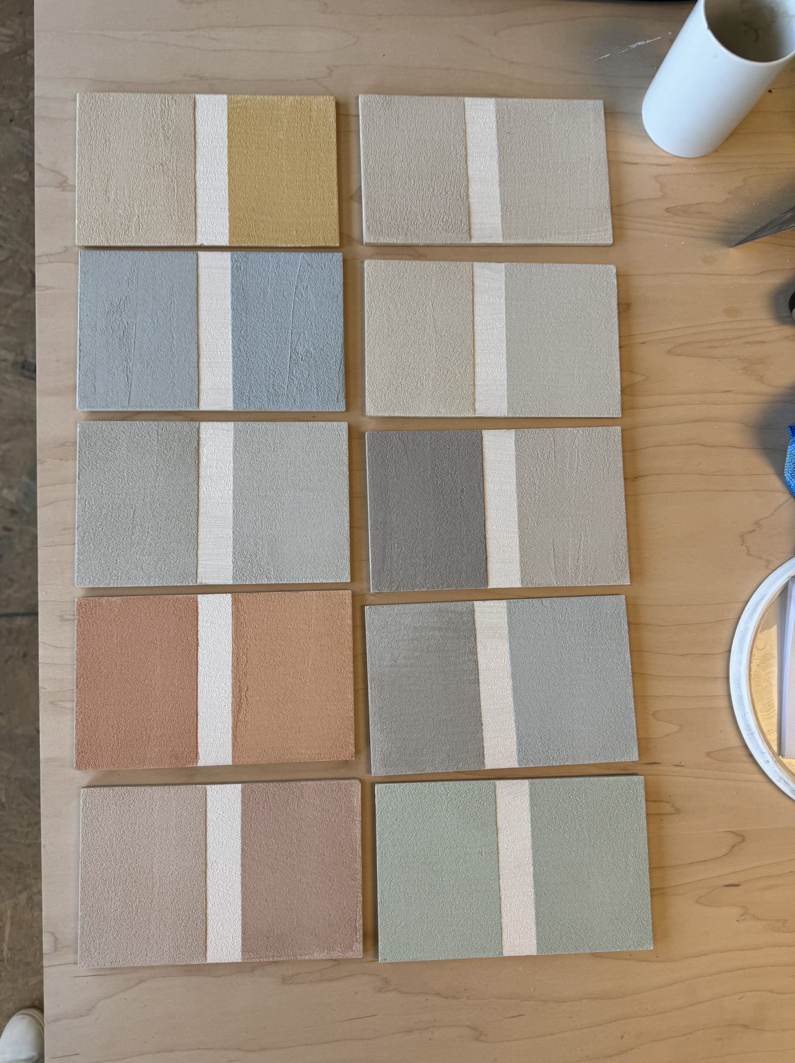
First layer is the base coat, troweled on and worked to establish the foundation tone and initial texture. This layer is about adhesion and groundwork, not final appearance.
Second layer is where the character gets built. The trowel angle, the pressure, the direction of the strokes — all of it contributes to that raw, directional texture that reads as concrete. Too uniform and it looks like a product. The variation has to feel intentional but not overworked.
Third layer and refinement — depending on the look, a final refinement pass is done to control sheen and sharpen the overall read of the surface. For a matte concrete aesthetic this layer is about restraint. You’re taking away as much as you’re adding.
Encausto or sealing closes the finish. For a concrete look I’ll often use a matte sealer that protects without adding any visual gloss. In wet areas, a more robust water-resistant sealer goes on. The sealer is what makes the finish durable over time — a properly sealed venetian cement wall is harder than drywall compound and will outlast most paint jobs by decades.
The whole process is hand-applied with a steel trowel, every square inch done manually. That’s why it looks like something real rather than something printed or rolled on.
How to choose the right sheen level for a concrete aesthetic
Sheen is one of the most important decisions in a concrete look finish, and it’s the one most people haven’t thought about before we sit down with samples.
Real concrete in the wild — think parking garages, raw loft floors, industrial interiors — is completely matte. It absorbs light rather than reflecting it. That’s the purest concrete read, and if you’re going for a very raw, austere industrial look, a flat matte finish is the right call.
But most residential spaces benefit from a little more life in the surface. A very low satin — barely perceptible when you’re standing in the room, visible when light rakes across at an angle — gives the wall depth without breaking the concrete aesthetic. I think of it as the difference between raw concrete and polished concrete. Both read as the same material; one has more presence.
Here’s how I think about sheen selection:
- Dead matte — strongest raw concrete effect, works beautifully in rooms with good natural light or dramatic artificial lighting. Shows application texture most clearly.
- Low satin — adds depth, feels more refined, still totally industrial in character. My go-to for living spaces and bedrooms.
- Medium satin — starts to shift away from concrete and toward stone. Can work in kitchens or bathrooms where you want some light interaction. Use carefully.
- High polish — this is no longer a concrete look; this is spatolato or marmorino territory. Beautiful, but a completely different finish story.
The lighting in your space is the deciding factor more than anything else. A north-facing room with limited natural light needs more surface activity — texture and a touch of sheen — to read well. A sun-drenched south-facing space can carry a pure flat matte without feeling dead.
I always bring samples to that conversation. Looking at a colour chip under showroom light tells you nothing about how a finish will behave in your actual space. The sample changes everything.
If the concrete look is something you’re considering — whether it’s a feature wall in a Westboro living room or a full bathroom treatment in a Kanata new-build — call me directly at 613-255-1512 or email Info@designerwallfinishes.com. Bring your inspiration photos, your material references, whatever’s on your phone. I’ll bring the samples, we’ll look at them in your space under your light, and we’ll figure out exactly which version of this finish does what you’re actually imagining. That’s how these decisions should get made.